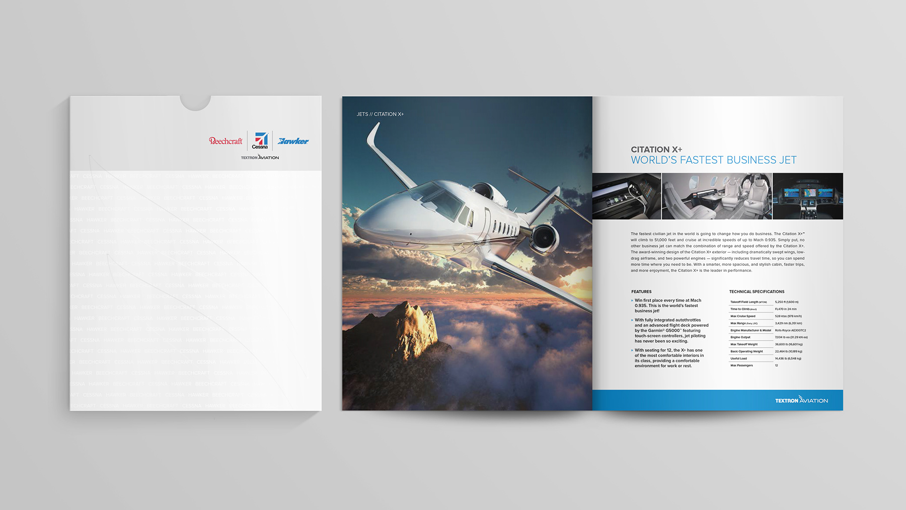
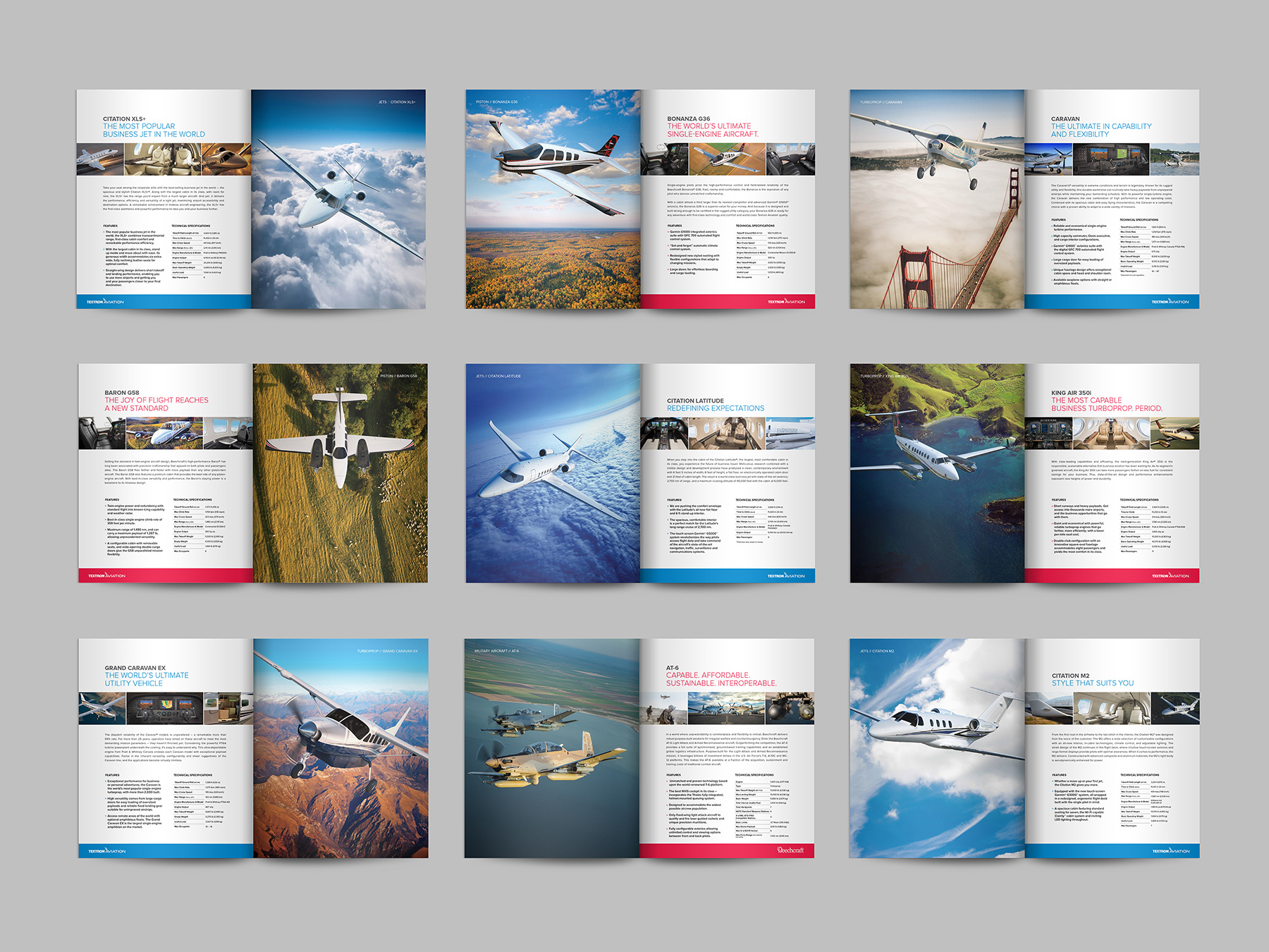
After nearly a century of each doing business independently in the aviation industry, the brands of Beechcraft, Cessna and Hawker were joined together under Textron Inc.
With the alliance of these former competitors came an urgency to develop a company segment that would act as an overreaching parent and encompass Textron’s growing aviation portfolio. Based on our reputation in the aviation industry and impressive spectrum of past work, the Beechcraft and Cessna marketing teams approached us for help developing the identity of the parent brand for Textron’s aviation companies, and introducing it to the public market.
Plotting the course.
To unify such distinct brands, each with loyal customers to satisfy, was a delicate balancing act. It was crucial to emphasize that the brands would remain unique, continuing to advertise and operate individually, but provide support for each other as they lived together as siblings. With Cessna’s sophisticated, serious, confident tone and Beechcraft’s personable, strong and inspiring brand personality, the parent segment needed to be subdued to avoid distracting from either brand.

Creating a timeless identity.
Keeping in mind that the parent segment needed to be subtle and retain the Textron identity while portraying aviation, the name ‘Textron Aviation’ was established. Simplistic and classic, Textron Aviation leaves no doubt about the industry being served, nor dwarfs its brands.
The same approach was applied when creating the company logo and identity. Textron Aviation’s logo needed to portray security, wealth, tradition and strength. It also needed to remain refined to avoid competing with its brands. The chosen logo is elegant and simple, using the Textron Inc. logo alongside a slender type treatment on the word “aviation,” as well as a winged element, which adds movement while still maintaining its minimalism.
To complement Textron Aviation’s timeless name and logo, the brand aesthetics are sparse and predominately grayscale which creates a muted edge of sophistication. This prevents the parent segment from clashing with the blue and red palettes used by Cessna and Beechcraft.


Announcement of a new family.
To announce the new family, a launch message was developed to fully encompass the alliance and Textron’s Aviation’s endeavors to lead the aviation industry as one.
Gaining Altitude. Together. A simple sentiment—Beechcraft and Cessna would continue to innovate the industry, but now they would grow, or gain altitude, jointly. Once the message was in place, we vigorously developed a launch landing site, billboards and a whirlwind of print ads to reveal the new partnership.

Positioning a fresh global presence.
The Cessna and Beechcraft brands individually had well-established presences at aviation trade shows spanning the globe. Under Textron Aviation, event efforts moving forward would be combined and customized to fit the needs of each show. From smaller flyover events featuring specific aircraft to large-scale presentations of the entire product line, like EBACE and NBAA, the strong new identity of Textron Aviation was elegantly displayed while using red and blue callout colors to emphasize the presence of each brand.

Building a multilevel digital landscape.
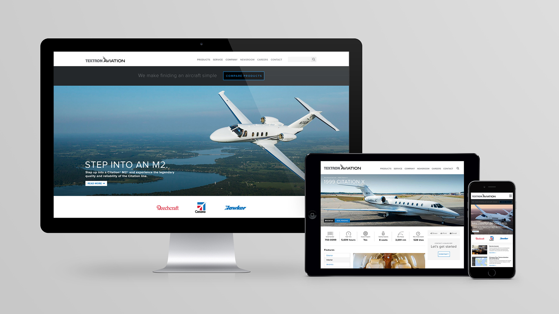
From the outset of the project, we approached Textron Aviation’s website as a process of unifying many different properties. Not only were three major aircraft manufacturers merging into a new, unified brand, but those brands wanted to retain some of their own identity within the new system. For us, creating a scalable, yet flexible, system would require a lot of foresight, planning and collaboration both internally and with the client teams.

Research & Strategy
With Textron Aviation being a new company, we knew that it would go through vast changes in the future. With this foresight, we strategically planned out how the site could meet the demands of today, but also create a flexible platform that would scale for future growth.
Responsive Platform
For the foundation of the site, we chose to build our layouts on a multi-column system with fluid grids, text and images. As you scale from large screens to small, the columns stack vertically to accommodate the space constraints. This keeps the site consistent across a wide range of devices.
A Tailored Experience
A main focus of the site design was creating unique sections to target different core audiences. These custom sections were developed based on users’ browsed content and preferences, each delivering a tailored experience with different imagery, messaging and functionality. This allowed the site to mature into a diverse and deep experience.