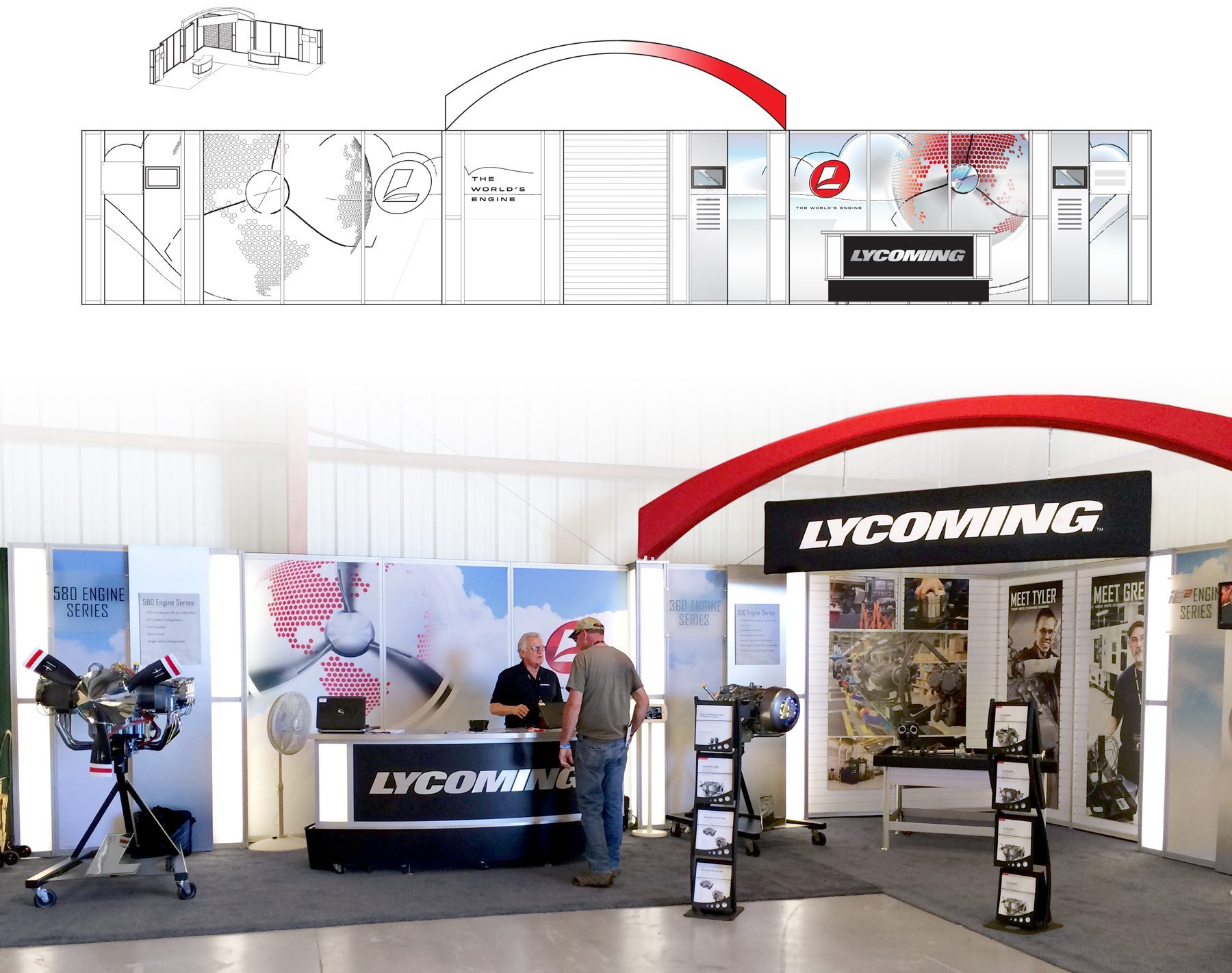
Lycoming Engines needed help establishing congruence in its branding. Meeting its reputation as a world-class manufacturer with a new look that filled in the missing pieces of its identity was our task. Not only was the rebrand rollout strategy in need of visual design, but gudience in providing continuity across global marketing efforts. Learn how business rebranding services truly integrate customer experience to new heights.
Lycoming’s story tells of a remarkable progression from a bicycle and sewing machine maker to the world’s leading piston engine manufacturer. More than 65 percent of all general aviation aircraft contain a Lycoming power plant, and a few engine models are even on display at the Smithsonian. For these reasons, Lycoming has secured a prominent place in aviation history.
Starting a Rebrand With Logo
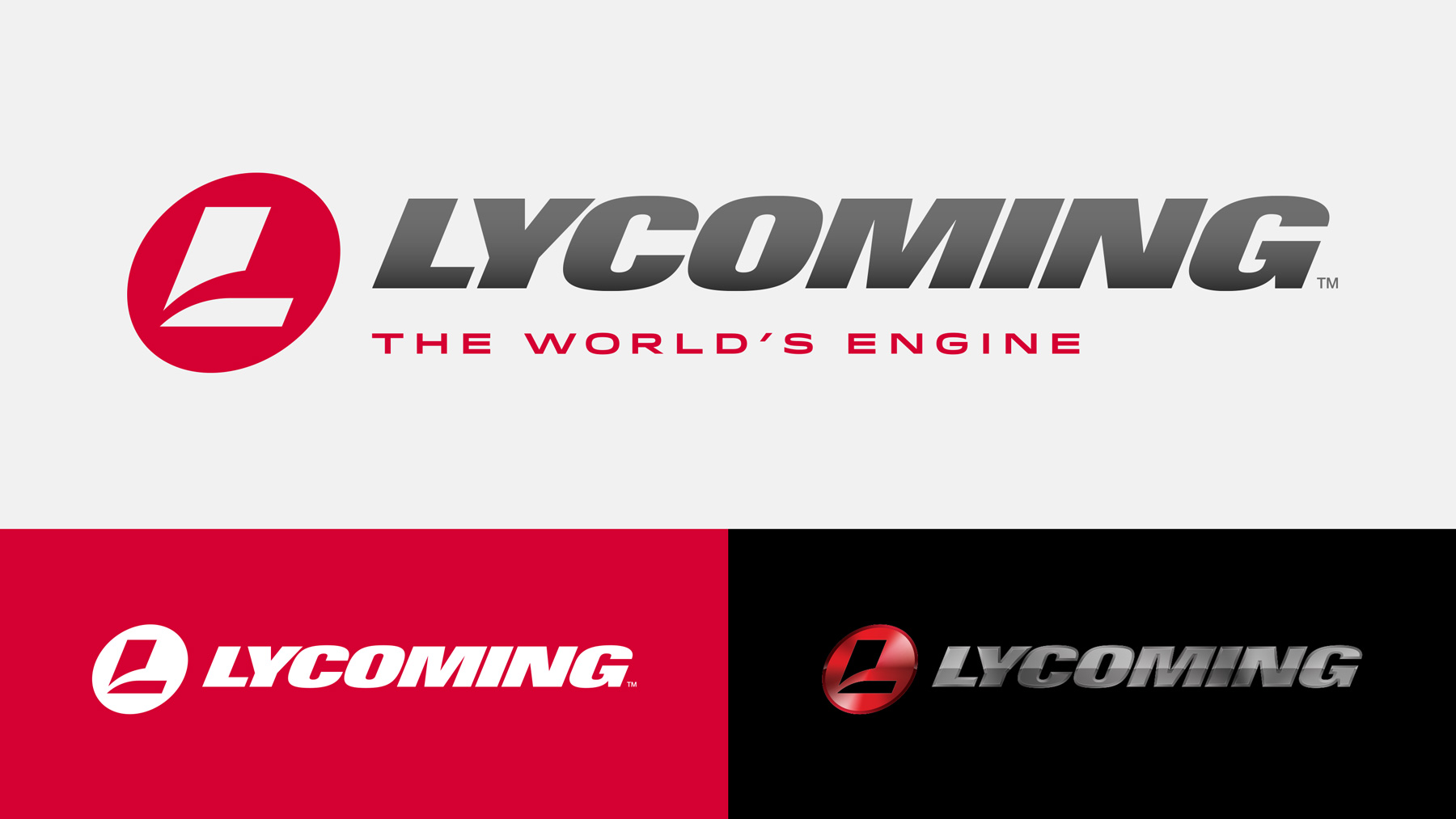
We supplemented the logotype with a mark that offers an additional hook for brand recognition. This emblem leaves a small footprint compared to the company’s eight-character name. During the manufacturing process, it can be stamped or embossed onto small components.
The mark’s design repeats the letter “L” in “Lycoming.” The slash element is reminiscent of a propeller blade. Like the company name, the mark is slanted to convey speed and performance.
Rebranding Taglines To Solidify What Matters
Brainstorming a tagline began with concepts related to product performance. However, it became clear that Lycoming had already cemented its reputation as a manufacturer of dependable power plants. Of the 300,000-plus engines it has produced, two-thirds still operate today.
The tagline evolved into a statement about brand power and people’s faith in the product. Since 1929, Lycoming has laid a foundation of trust not only with aviators around the globe but with aviation authorities too. More than 700 Lycoming engine models are FAA-certified, and it remains the only FAA-certified helicopter piston engine manufacturer.
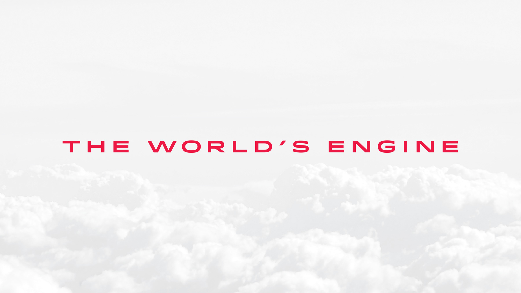
“The world’s engine” was chosen as a seal of authenticity for one of the most prolific and universally championed brands in aviation.
Integrating Global Rebranding Marketing Strategy
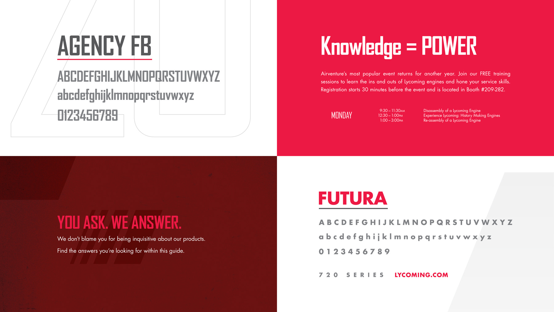
Lycoming’s previous branding was cast in dark colors, which didn’t quite suit a company that creates the beating heart of an aircraft. The somber shades were substituted with metallic grays and a vibrant red. More white was introduced into designs. Now Lycoming ads feel light, airy, and appropriate for content related to flight. The new aesthetic also brings cohesion to Lycoming’s marketing.
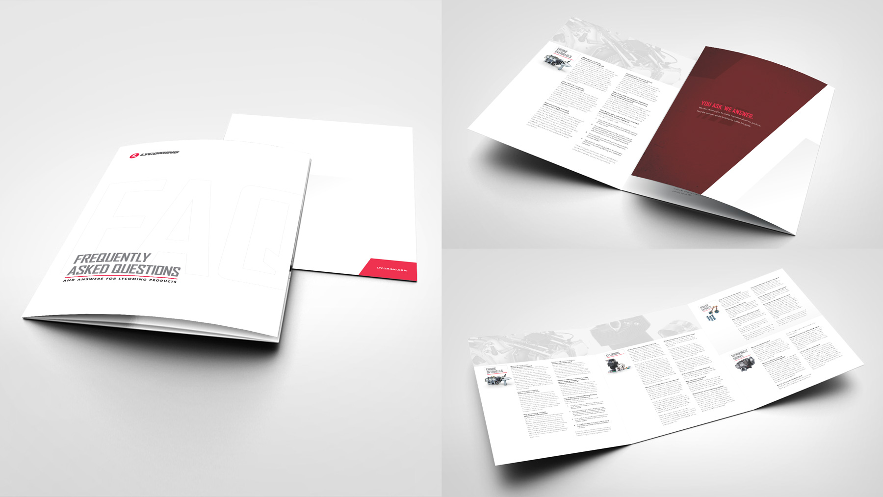
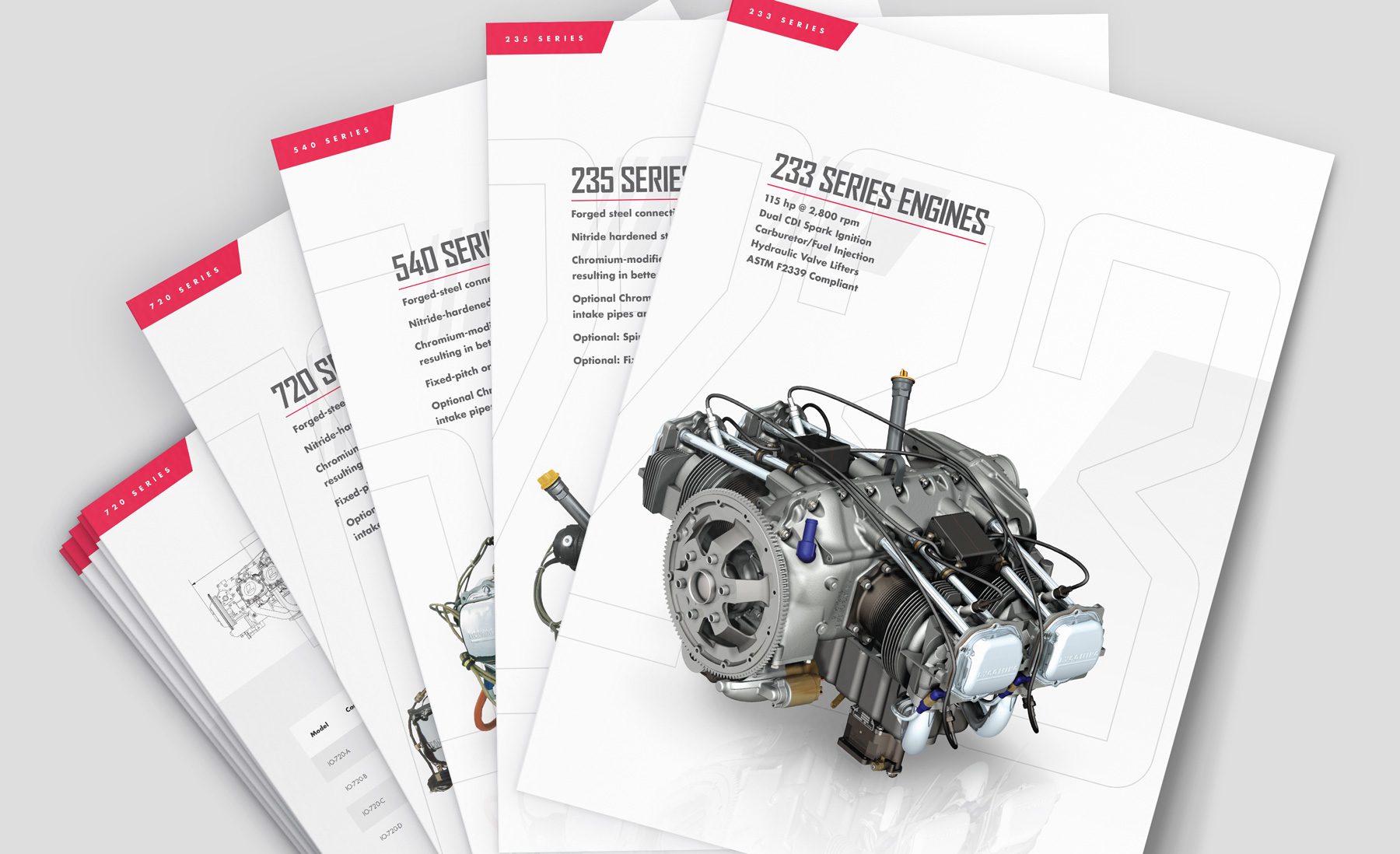
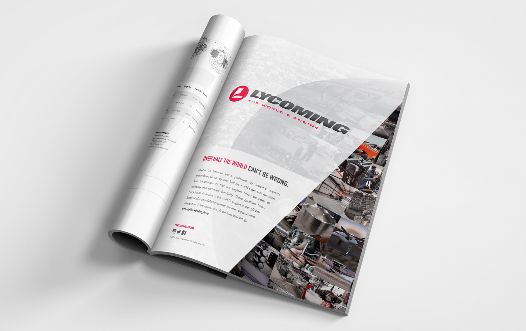
Global Business Rebranding Services For Industry Impact
The logo mark, tagline, and palette elevated the visual appeal of trade show booths. Rebranding strategy that integrated all aspects of company touchpoints while catering to concept art shows helped push the evolution. Reimagining the design sketch into a three-dimensional showcase of objects refreshed industry perception by new branding.
