Time flies when you’re growing a business. Before you know it, 20 years have passed and you’re still using the same old brand assets. It’s an all-too-common story in our line of work. This one is about brand development for an industrial marketing company.
Founded in 1991, Fiber Dynamics quickly built a reputation for efficiently manufacturing tough and highly complex composite parts. It wasn’t long before major aviation brands and defense contractors came knocking at the door. The company expanded for the first time in 2005. A few years later, it was already making plans to do it again.
Logo Refresh
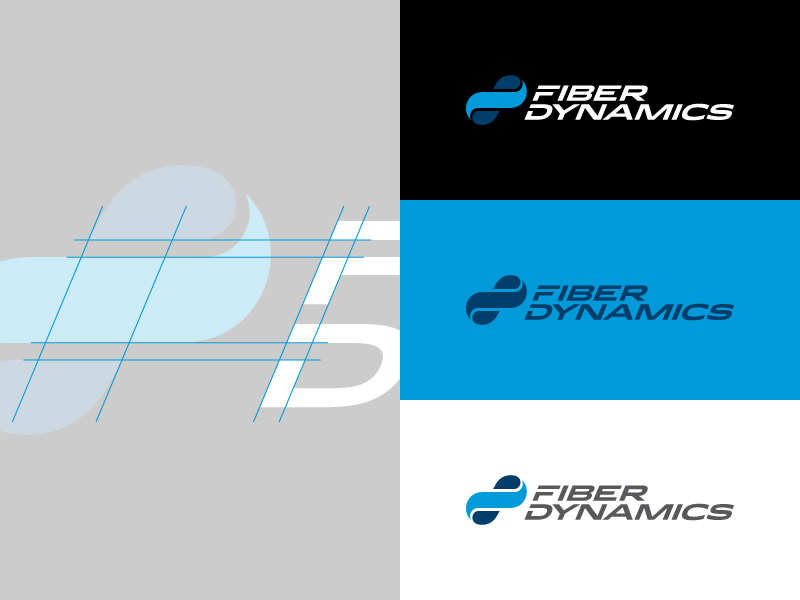
The corporate branding was a product of the ’90s and typified the tech marketing of the day. We proposed a refresh to help protect the last 25 years of brand equity. Refreshing a brand isn’t about reinventing the wheel, especially when the ideas of yesterday still have something important to say. For example, the logo’s infinity symbol represents enduring value for customers and employees. We redesigned it with new relevance to composite technology. The woven appearance mimics carbon-fiber textiles used in the manufacturing process.
Less is more has become a standard approach in modern marketing. The new logo design favors clean-cut concision over gratuitous details. It pays homage to the past while leaning toward the future.
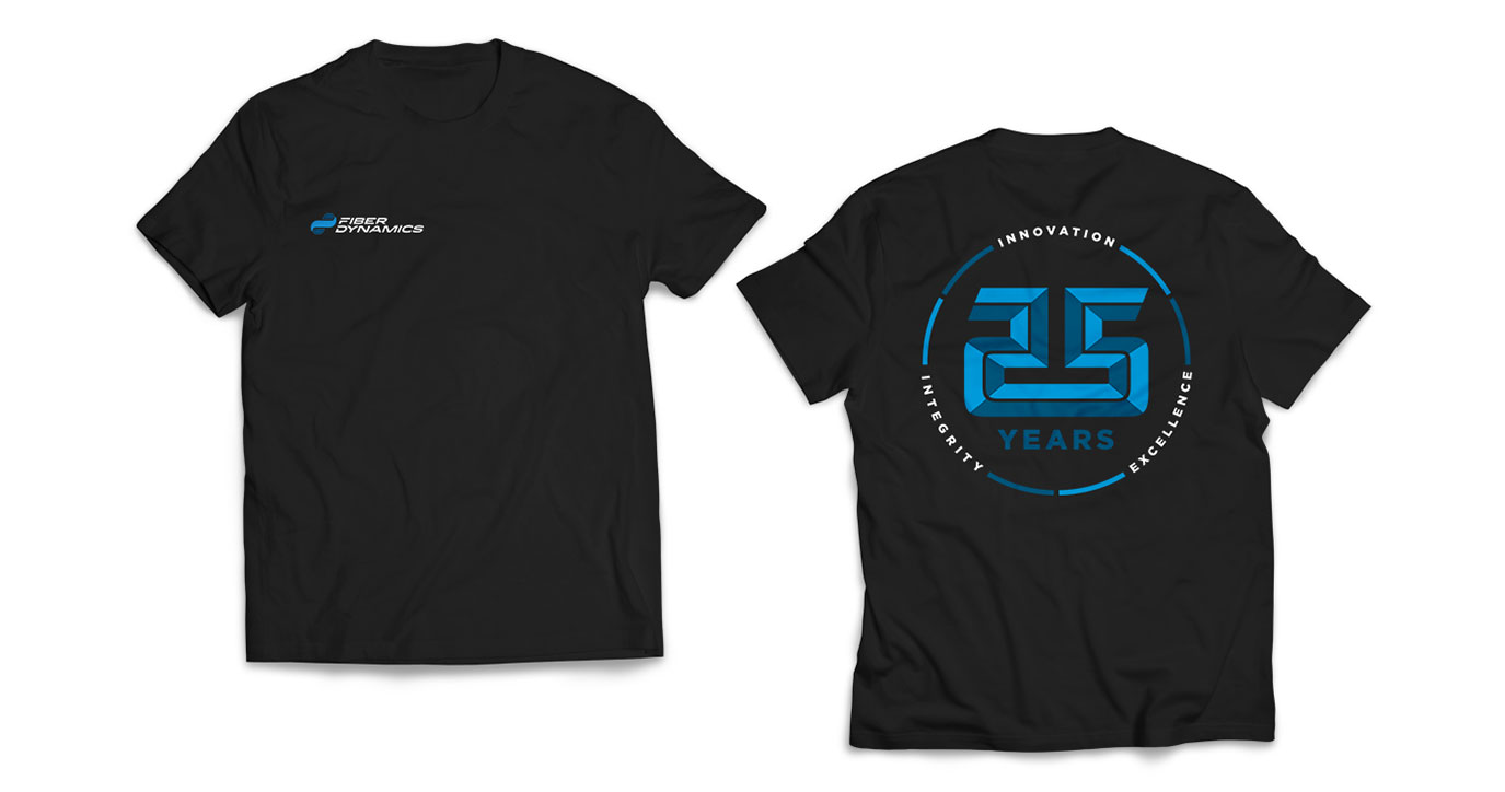
Commemorative T-Shirt Design
The logo was finished in time for the company’s 25th anniversary. A commemorative T-shirt was designed to celebrate the milestone and give employees the opportunity to spread brand awareness while out and about in the community.
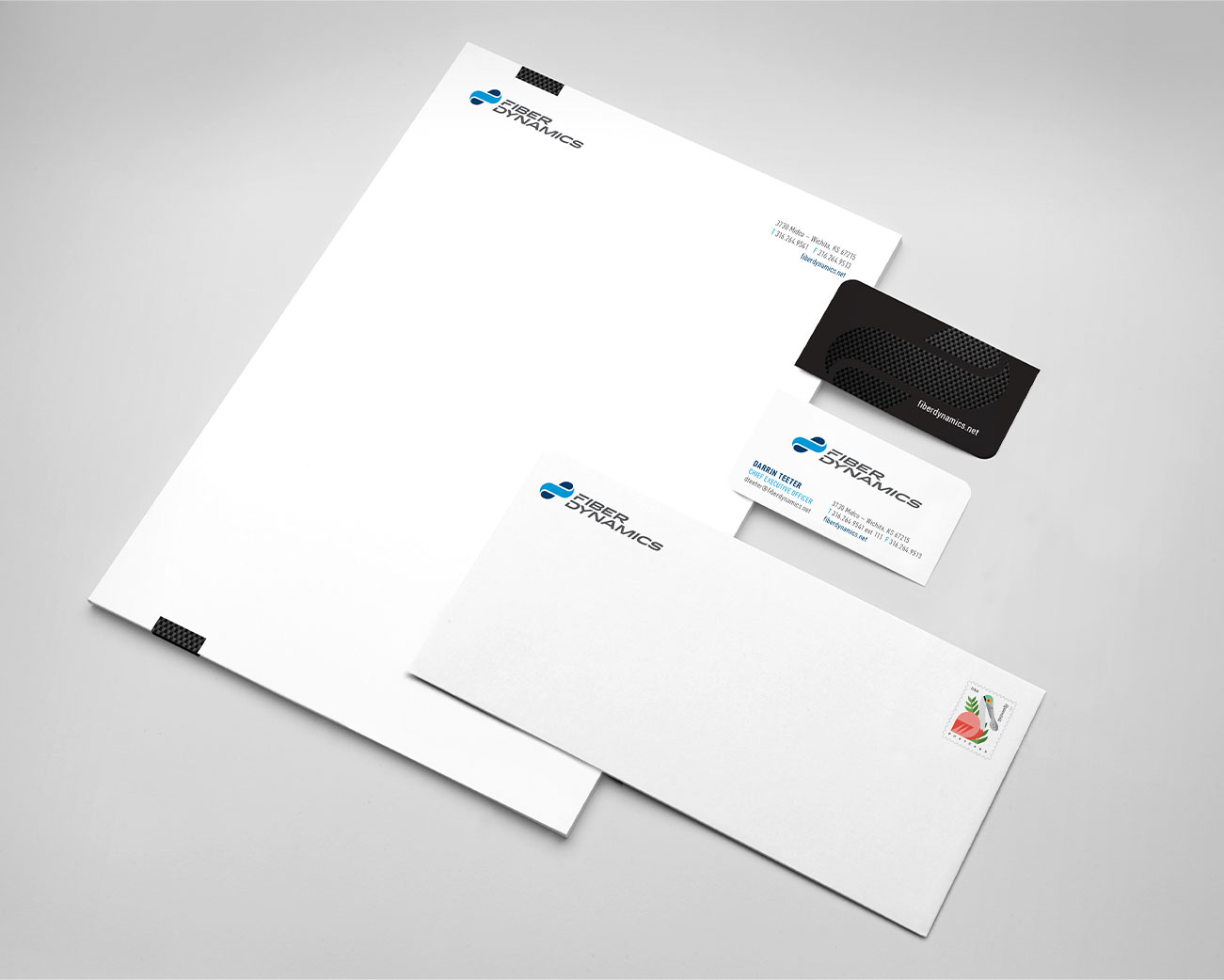
Branded Corporate Stationery
Even in the digital age, handing out business cards is an efficient way to initiate people into your brand. These cards introduce a bold new element — the rich texture of carbon fiber, a key ingredient in the recipe for composite parts. The pattern also appears on the corporate letterhead.
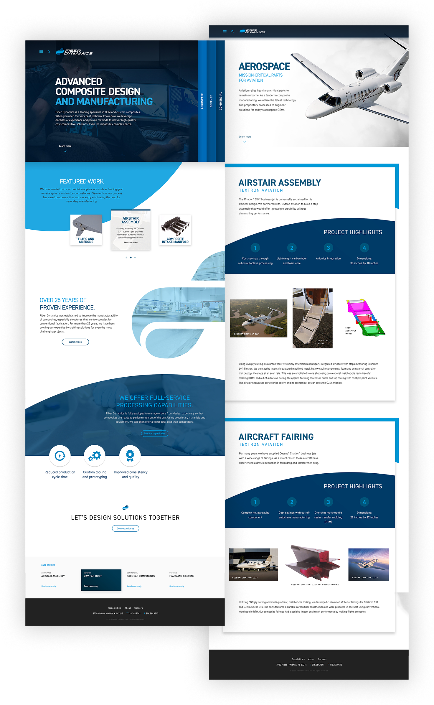
Manufacturing Web Design
We remodeled the website to project the image of an innovator. The site features unconventional navigation with menus taking up unique positions; clicking on them produces surprising effects. Innovative web design can go too far when it frustrates the user’s expectations. We customized this online experience to feel both intuitive and outside-the-box.
The site repeats motifs from the logo in striking ways. Floods of color and swooping curves simulate movement and draw the user from one section to the next. We selected photography that showcased an enormous capital investment and wide range of work. Imagery is a powerful tool for helping the audience infer capabilities, especially when NDAs prohibit a company from talking about specific projects.
The sparing use of words and airy design keep the conversation light. Even manufacturing websites aren’t meant to be technical encyclopedias. They’re brand stories, and the best-told tales will leave the audience with an appetite to hear more.
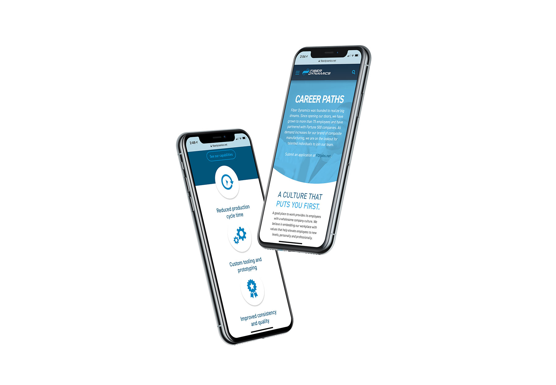
One of the biggest reasons for a brand refresh is the need to adapt marketing strategies to mobile technology. There are no two ways about it: Brands must live comfortably on the small screen, or else they risk alienating a huge percentage of the population that uses phones to access the internet.
Full-Service Branding
Companies that promote themselves as innovators ought to look the part. Our client now has the brand assets of a major player in the composite parts industry. The transformation was dramatic, but brand refreshes happen in small ways, too. Even a minor logo update can bring manufacturing marketing up to speed.
If this story made you think about your industrial branding, it might be time for a refresh. As a full-service brand development agency, Jajo is equipped to design and produce all the components for a successful brand transformation.