As a designer, I find inspiration in lots of things. The rings my water glass makes, a beautiful color palette, a well-organized bookshelf, a meticulously kerned block of copy. But one of my favorite things to study is everyday signs. Largely, the actual design of a sign goes unnoticed, but when you take a second to look, there are some real gems out there. Whether signs are professionally designed or not, they can impart humor, elicit joy, tell a story and make a statement. I’ve started to pin down what makes them memorable.
Placement
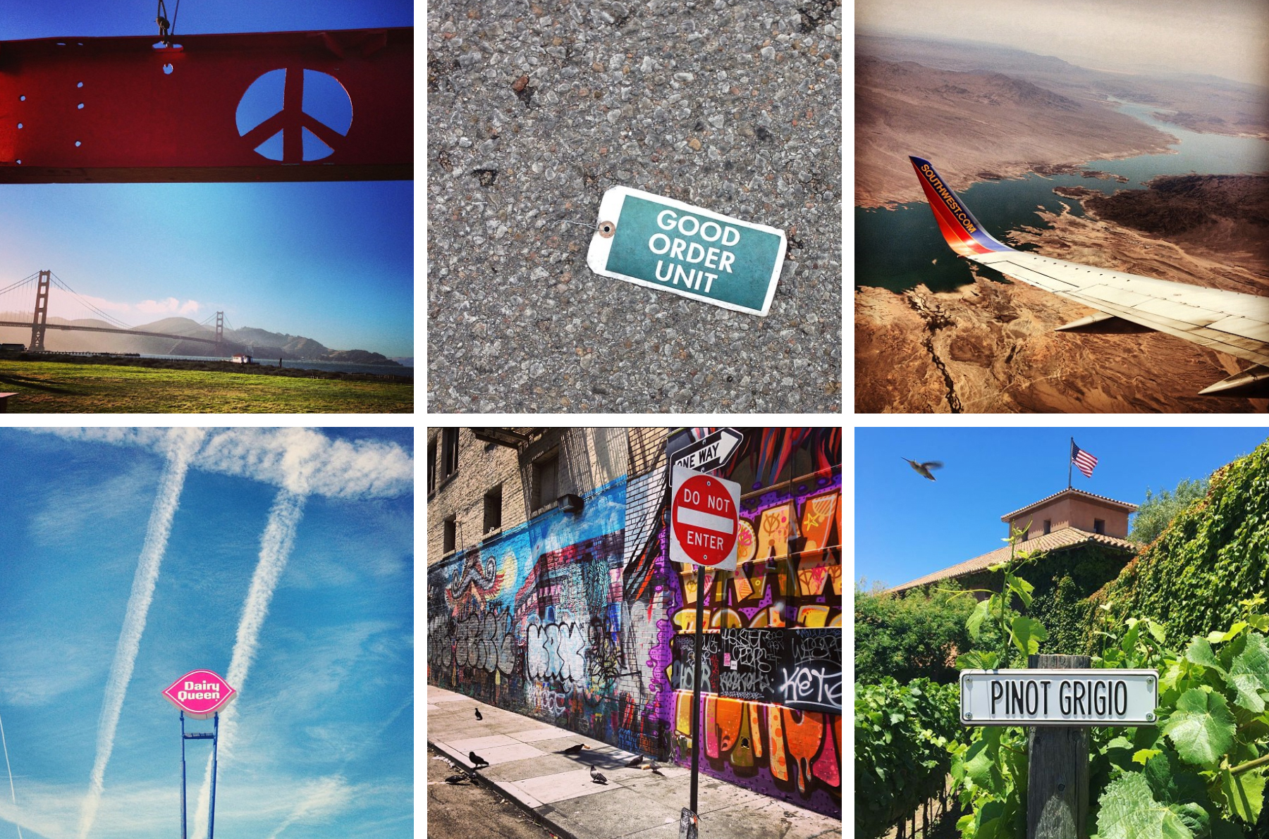
These grabbed my attention because of their placement. The peace sign is a small part of installation art, but the landscape gave me a true feeling of San Francisco. The Dairy Queen sign itself isn’t that remarkable, but the sky behind turns it into art. I took the photo of the Southwest Airlines wing on the way to California because I liked the idea of an advertisement with the world as its background. When I saw the “Good Order Unit” tag, conspiracies flooded my mind until someone told me it was actually a repair or inspection tag from a local business, but for a second my imagination had a lot of fun. If these signs were in other environments, the same emotions or stories would’ve never existed.
Typography
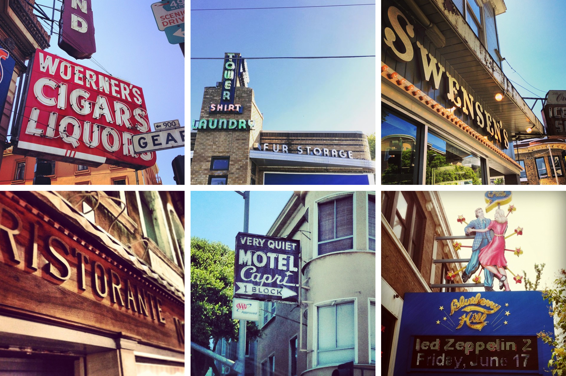
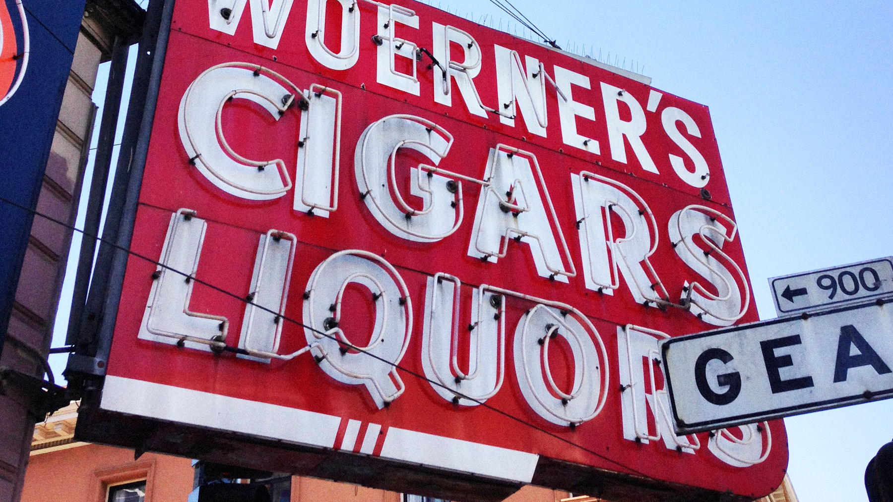
These signs don’t say anything remarkable, but the type makes me nostalgic for a time I was never a part of. “Very Quiet Motel Capri 1 Block” took me back to the book “Beautiful Ruins,” about old Italy and old Hollywood. The smorgasbord of noise surrounding the cigar sign, in theory, should be overwhelming and awful, but the type, shapes and color work together beautifully.
Personal Touch
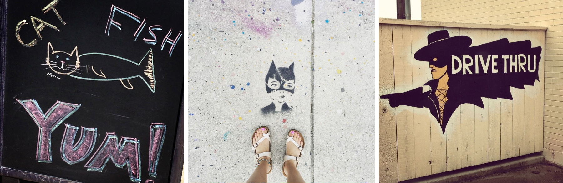
There is something endearing about a hand-drawn sign or guerilla-style tagging. The “Cat Fish” sign was outside a local eatery. It’s silly and actually really disturbing, but I laughed and want to meet the person who did it. The cat woman stencil was in Miami. I was on vacation feeling fancy-free, and seeing this was inspiring and wild. I adopted her as my spirit animal. The short-armed Zorro — he warms my heart.
Hilariously Wrong
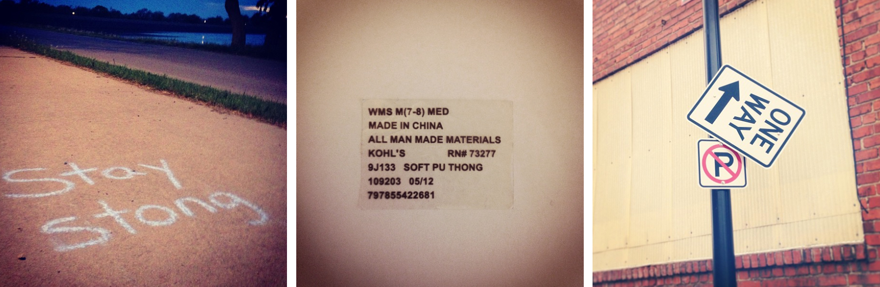
You have to admit, design mistakes can be funny and memorable. Seeing these further heightens my awareness to never make them. I discovered “Stay Stong” while on a grueling run. It made me laugh and lightened my step. Then we come to the sticker on the bottom of my flip flop. I read it by pure accident and discovered the name was “Soft Pu Thong.” This likely has some meaning to the manufacturer, but the small child in me chortled for far longer than acceptable.
Design is all around us. Regardless of how simple or flawed it may be, there is beauty to behold in some of the most everyday forms. Whether you’re on vacation or headed to work, pay attention to the signs around you. What was once just a flash out your window may make you pause. You might discover a hidden gem you didn’t see before or just find a new appreciation for a world you may have been missing all along.