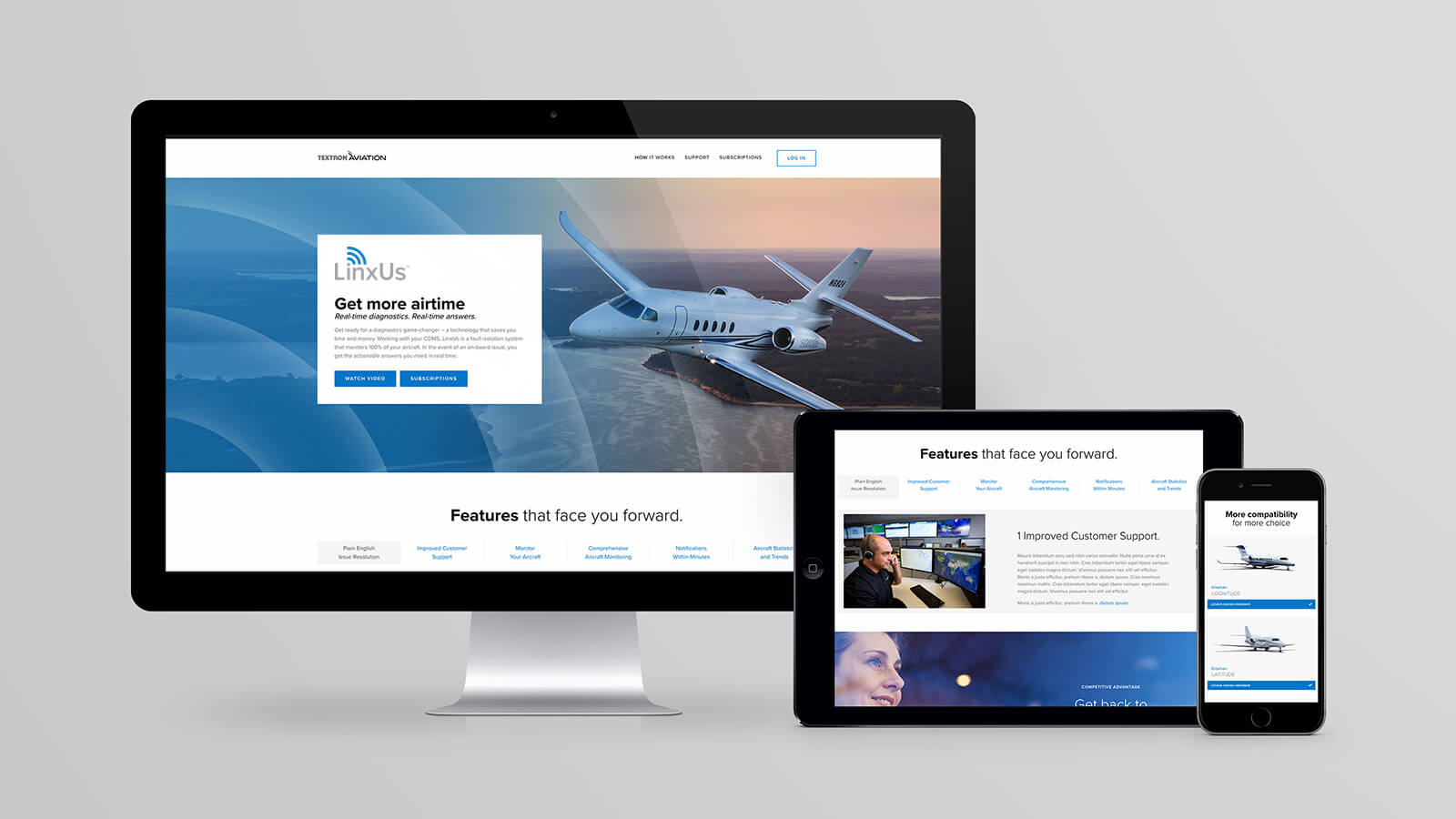
When new technology enters the marketplace, it’s important to unravel the complexities and shine a light on key features and benefits. That’s what the LinxUs campaign accomplished for Cessna customers.
LinxUs is a fault-isolation system that speeds up troubleshooting. When an aircraft experiences an issue during flight, LinxUs diagnoses it and notifies maintenance crews by email. Before LinxUs came along, fault data had to be manually downloaded from the aircraft. Now it happens wirelessly and automatically, giving crews time to plan a repair.
How To Launch A Product While Speaking Through The Brand
The campaign began with an essential first step: introducing a new product through clear-spoken branding. Because of the product’s highly technical nature, the logo required a simple design that quickly identifies the primary feature: wireless data transmission.
Email alerts are sent over Wi-Fi shortly after touchdown. In addition, messages can be transmitted in flight via satellite. One of the challenges Jajo faced was positioning both products under a single service, even though they work differently. The addition of “Air” not only distinguishes LinxUs Air as an enhanced product, but also clues people in on its capabilities.

Providing clarity for customers.
To assist customers’ understanding, we often suggest video as a tactic when introducing a new product. This execution utilized an illustrative style to simplify the complexity of the technology from a visual standpoint and make the products more approachable. The animation incorporates the differences between the two while explaining how the service works — all in just 60 seconds.
Efficient content delivery.
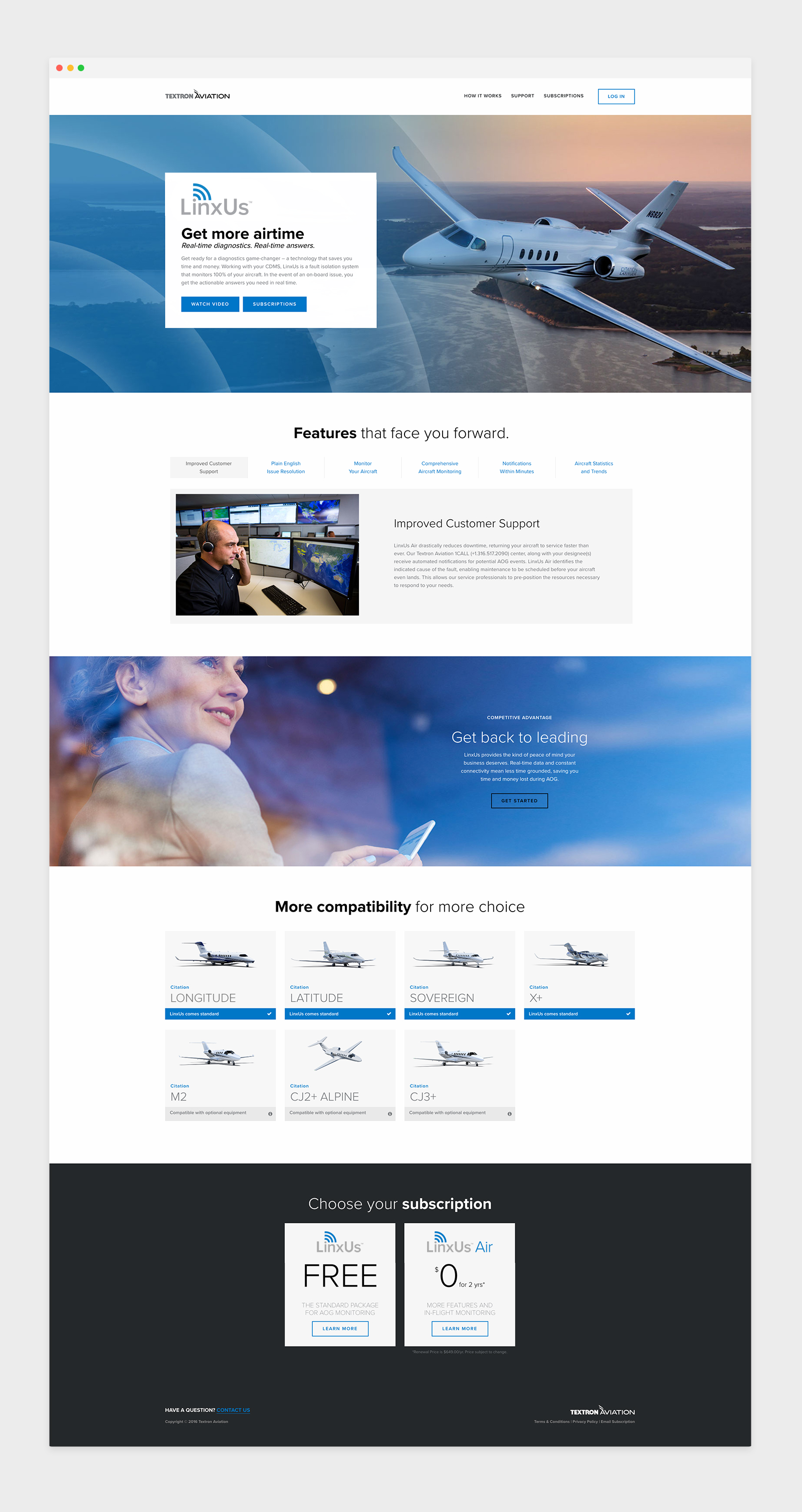
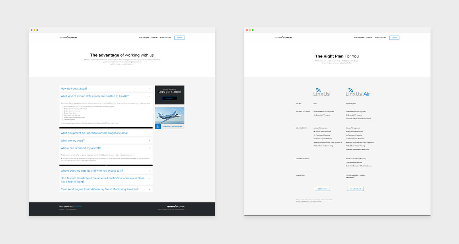
There’s a lot customers need to know about the new offerings — capabilities, benefits, compatibility and distinguishing characteristics. The microsite is designed and developed to educate users in the most efficient way possible. Clean, organized page designs give the content breathing room so that customers aren’t faced with information overload.


