Taking the Road Less Traveled
Where it all begins
Building a website is a bit like designing a building. Goals have to be established, a location prepared, plans drawn up and feedback accounted for, all the while considering how the space should feel to those experiencing it when it’s finished.
A website is a sum of its parts — each detail must be thoughtfully placed and every possible interaction considered. Art and copy should create emotion, the interface easy to use and the framework firm, yet flexible. Only then will the final product feel cohesive and resonate with the person experiencing it. Before we get there, however, there are various stages that we must orchestrate to bring it to life.
Creating a Strategic Plan
Using size and simplicity to our advantage
Defining the business objectives is an integral part of any website redesign. These business goals are important because they act as a target to aim for, and allow our designers to make strategic decisions. After first meeting with Andover State Bank, it was clear we needed to determine the company’s goals, where they were headed and how we could help get them there.
The company wanted to limit expansion and focus on the quality of customer service. Taking this focus into consideration allowed us to explore a simpler user experience centered on the emotional strengths of the bank. That said, we arrived at a few key goals for the website that gave us a firm foundation going forward.
- Acquire new customers
- Take care of existing customers
- Enhance the online experience of the brand
- Create a tool for users to find information
- Provide clear access to online banking
The Pursuit of Authenticity
Designing content for emotion
From the initial conversations with Andover State Bank, it was clear we’d be adapting their new brand for life in the digital world. To properly position them, we began by performing competitive research. Research showed most banks typically do a poor job of channeling authenticity with both customers and non-customers. Colors are limited, imagery is small and the brand voice is sterile. All of these work together to create a flat customer experience, leaving users feeling unfulfilled.
Authenticity became one of the major pillars for our design language going forward. Leveraging the creative strategy that had been created for their brand, we worked to craft existing and new information that would not only work well for digital consumption, but also create an emotional connection with the end user.
Messaging
The most concentrated dose of this positive energy lives within the copy of the site. Headlines are bold and friendly. Body text is light and easy to consume. The copy speaks conversationally as a friend would, aiming to close the gap between brand and the user consuming it.
Art Direction & Photography
From the outset of the project, we looked for imagery that conveyed an attitude of authenticity, confidence and joy. We wanted to show the warmth of human relationships in whatever form they take. Whether it’s buying a coffee at a local cafe or purchasing a home from a local realtor, these relationships are vital to the success of the individual and the community.
Bringing It All Together
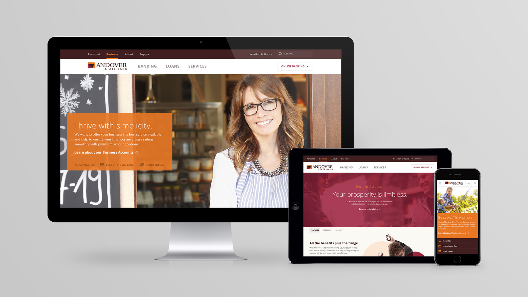
The majority of banking websites approach their design with a sense of sterility – white or gray backgrounds full of rigid grids, black text and saturated buttons. For Andover State Bank, we pushed for the interface and elements of the website to evoke a sense of comfort and confidence; the colors are vibrant, yet soothing. Large buttons, light typography and custom iconography create a subtle and clear assurance that Andover State Bank has your back.
Managing Content at Scale
Designing the foundation
Estimating the Content Needs
In order to properly design and build our content management system we decided to start with determining what our content needs were. The bank didn’t have aggressive content plans, product offerings seldom change and the bank was not staffed to maintain regularly posting content. However, due to the size of the investment, we determined it would be best to create a back-end to fit their needs. Allowing them to update their own site when they were ready to make changes without the need for developers.
We designed and tailored the information architecture to intuitive for how someone would want to browse. This architecture helped us with the development of the content management system, as well as plan for all of the content generation.
The Technology
The core functionality of the website is rooted in WordPress. It’s one the Internet’s most widely used and supported content management systems (CMS), plus it’s free and easy to use. WordPress is inherently designed to allow website’s owners to create and edit web content from anywhere, or on any device. This development route worked perfectly for ASB, allowing them the freedom to update their website at will.
Keeping in mind ever-changing traffic trends, we wanted to create the website with a mobile-friendly approach, as well. For Andover State Bank, we opted to use Twitter’s Bootstrap framework, which helps developers by pre-determining when and how content adapts to fit the user’s device.
Search Optimization
During development, the website was infused with proper SEO structure for search engines and users alike. For search engines like Google, this means proper usage of headings, paragraphs and links within the content of the site, as well as using dynamic page titles, meta data and open graph data for sharing the website.
After all of these unique parts are set in place, revised and perfected, what we end up with is a final product that nobody else can claim — a new experience.


