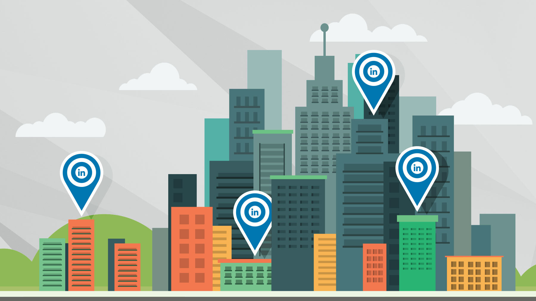
Responsive web design has been thrown around for a while now, so long in fact, that the term is becoming kind of passé. It seems like every advertising agency is offering the service and claiming that responsive web design can save your website from itself and turn your business around in the process.
While some of these promises might be backed up with some element of truth, there is a lot of exaggeration going on in the process. Your website is one important piece of your overall marketing strategy, but so is how your brand communicates with customers on a day-to-day basis. Don’t be fooled — focusing on responsive web design as the solution is a bit like looking through a camera lens, it can provide some great focus, but it doesn’t show what is beyond the frame.
Providing some clarity
By definition, responsive web design is an approach to web design aimed at crafting sites to provide an optimal viewing and interaction experience across a wide range of devices. Google search it and you’re likely to find hundreds of wonderful articles explaining what it is and how to do it, and there are even free templates for purchase that work quite well if all you want is something generic. Responsive websites can come in many shapes and sizes, and the best ones are seamless from front to back. Simply put, responsive websites look like this:
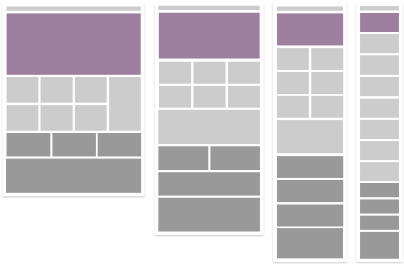
Let’s focus on how this illustration applies to your business. What does this mean for you?
Designing the user’s experience
Effective web design is all about customization and tailoring to your users’ specific needs. In order to provide a useful experience to your potential customers, you must first consider how and why they might be coming to your website in the first place. There are a wide variety of needs and all of them must be thoughtfully considered and placed into the website architecture. Nothing is more frustrating than coming to a website and being unable to complete the task you were there to do in the first place, and even worse is getting trapped moving from page to page digging for something that isn’t easily found.
Defining how various users are going to use your site will mandate how you approach the design at its various breakpoints. For instance, a mobile user who is interested in long reading at home on their couch will have different needs than a user who is logging in on a desktop computer in order to perform some kind of transaction or research. Remember, people are searching for information when they access your website, and providing a tailored experience for each device is key to keeping customers happy in the long run, which is a huge win for your brand.
Creating relevant content
There has long been an expression in our industry that “Content is King,” ever since Bill Gates first published it on the Microsoft website in 1996. That statement still rings true for us today as we go about creating more products that live online. The more information that is out there, the more important creating relevant content is. Your customers are not browsing your website to see how it was built and what fancy tricks you used to pull it off, they are interested in what you have to say and who you are as a company. Responsive web design helps deliver it to them as effortlessly as possible.
Here is a simple checklist from Google that you can use as you begin thinking through what information you are going to provide to your customers.
Nurturing the finished product
The very nature of the Internet has given business both a blessing and a curse of transparency. Businesses that fail to be authentic with their customers are usually called out directly through social networks, and sometimes that can end up being a huge problem for a brand. Now, while this is a very scary thing to many businesses, it has an upside. The age of Internet transparency has broken down almost all of the walls between brand and customer. It’s this very nature of direct feedback that forces brands to increase approachability. Don’t be alarmed — this is a very good thing. You can now tap into your tribe and communicate with them directly.
Your customers are real people with changing needs, and your website needs to keep up. But don’t let that overwhelm you, if you’re thinking about building a responsive website, just remember to be authentic, and plan on growing with the changing needs of your customers.
What it means to you
It means that you have a tremendous opportunity to reach people that you haven’t reached before and reconnect with customers that you’ve lost touch with. Your potential users are everywhere, all using various devices, all at different times. You have an opportunity to build one of the biggest communication tools that your company can have — one that can grow and change over time. All it takes is some planning, dedication, and a little elbow grease to make it happen. Oh, and some smart individuals to help you along the way.