As a new parent company, Great Lakes Polymers Holdings Corporation aspired to establish a bond with its subsidiaries and guide them toward success. Jajo, a brand architect with expertise in such family matters, stepped in to offer support.
Starting a Family
This family tale begins with Great Lakes’ acquisition of Bridon Cordage and Fabpro Oriented Polymers, two manufacturers that shared twin-like commonalities. Both started in 1975 in small Midwestern towns. Each one was about the same size, possessed similar capabilities, and operated within the same industries.
Our brand analysis revealed two companies with entangled product lines. To take full advantage of their allied strength, Great Lakes needed to segregate its roles and allow each brand to focus on doing what it does best.
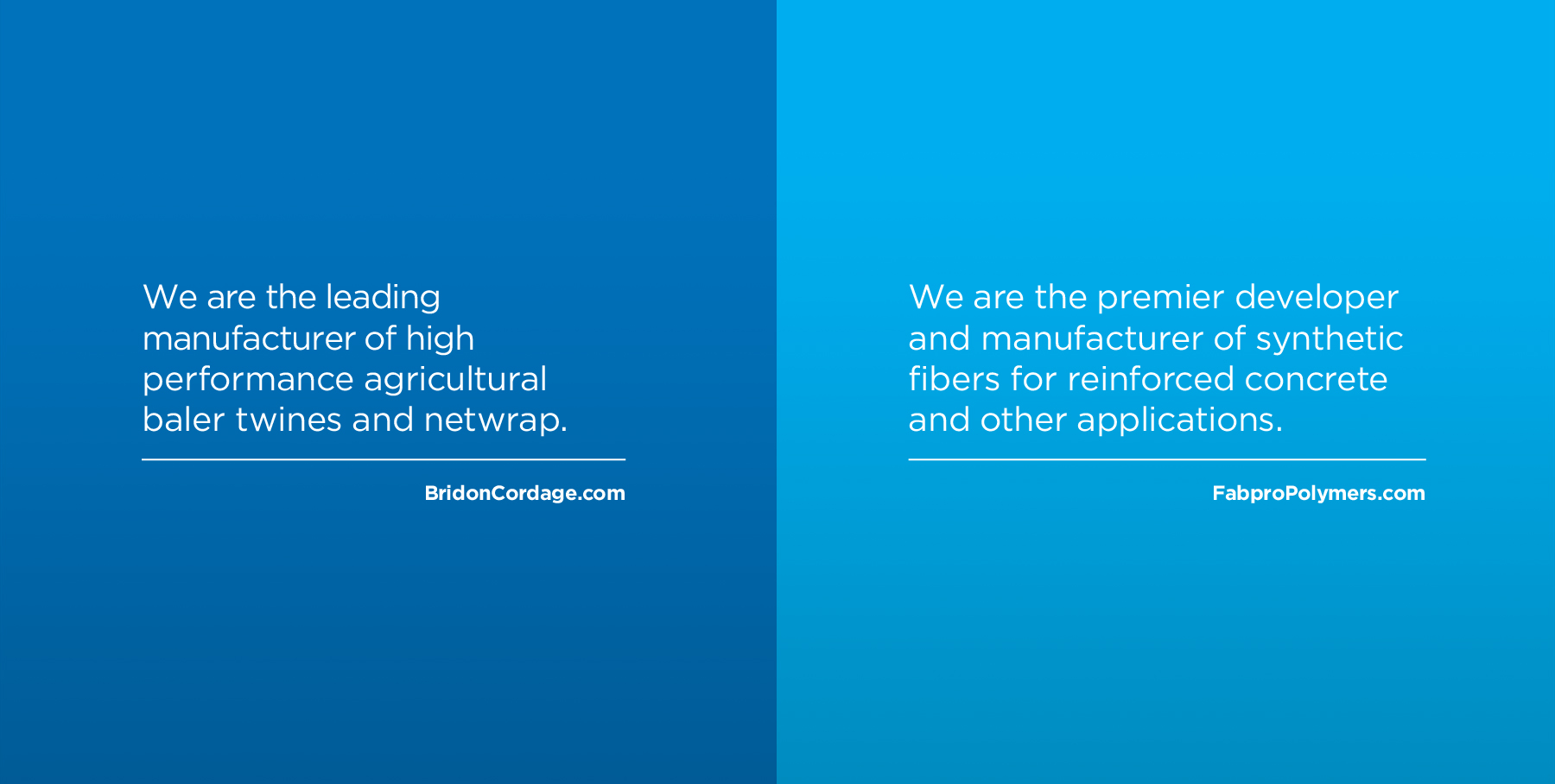
We suggested that Bridon maintain its stronghold in agriculture as a producer of hay bale twine and net wrap. Fabpro, on the other hand, would focus on manufacturing concrete-reinforcing fibers for industrial applications. Their newly defined roles would enable them to corner distinct market shares and expand without ever competing.
Parent Involvement
We began developing a stronger name for Great Lakes Polymers Holdings Corporation. The corporate speak suggested a remote, solely financial relationship between the companies. But like any good parent, Great Lakes cared deeply about its children and took an active role in ensuring their success.
“Great Lakes Polymer Technologies” was chosen because it described more than a holdings company. It positioned GLPT closer to the factory floor — within the sphere of innovation where Bridon and Fabpro operated. The new name was also inclusive enough to permit future growth into other industries.
A corporate logo was designed to symbolize GLPT’s broad capabilities, which appear as an abstract weave of various hues and shades. The initials “GLPT” span the entire color spectrum. Meanwhile, the logo’s circular shape represents global recognition and leadership in the world of polymer engineering.
![]()
Emergent Identities Through Rebranding
Bridon and Fabpro have long-standing reputations for turning out high-quality products. For this reason, a pluralistic brand architecture best suited their interests. It was determined that their logos should retain basic identity features. After all, many employees and consumers had been associated with these companies for 20 years or more. When you invest that much time and money into a brand, it forms part of your own identity. Radically changing the look is risky; it could lead to disorientation or, worse, fractured brand loyalty.
Some changes were justified to modernize the design and signal mutual endorsement. For example, standardizing the typefaces of “Cordage” and “Polymers” created a common denominator between the logos. Extraneous and distracting graphical elements were removed, and the primary colors were brought into the same orbit. These modifications achieved the kind of resemblance you would expect to see among siblings. And they helped the logos feel more comfortable living side by side.
![]()
Sending the Right Message
It was important to formally advise the public about each brand’s reoriented goals. Since Bridon and Fabpro were now serving different business segments, customers needed to know where to turn for the right solution. Both companies’ positioning statements were recalibrated to clearly identify their target audiences.
Broadcasting the Brands
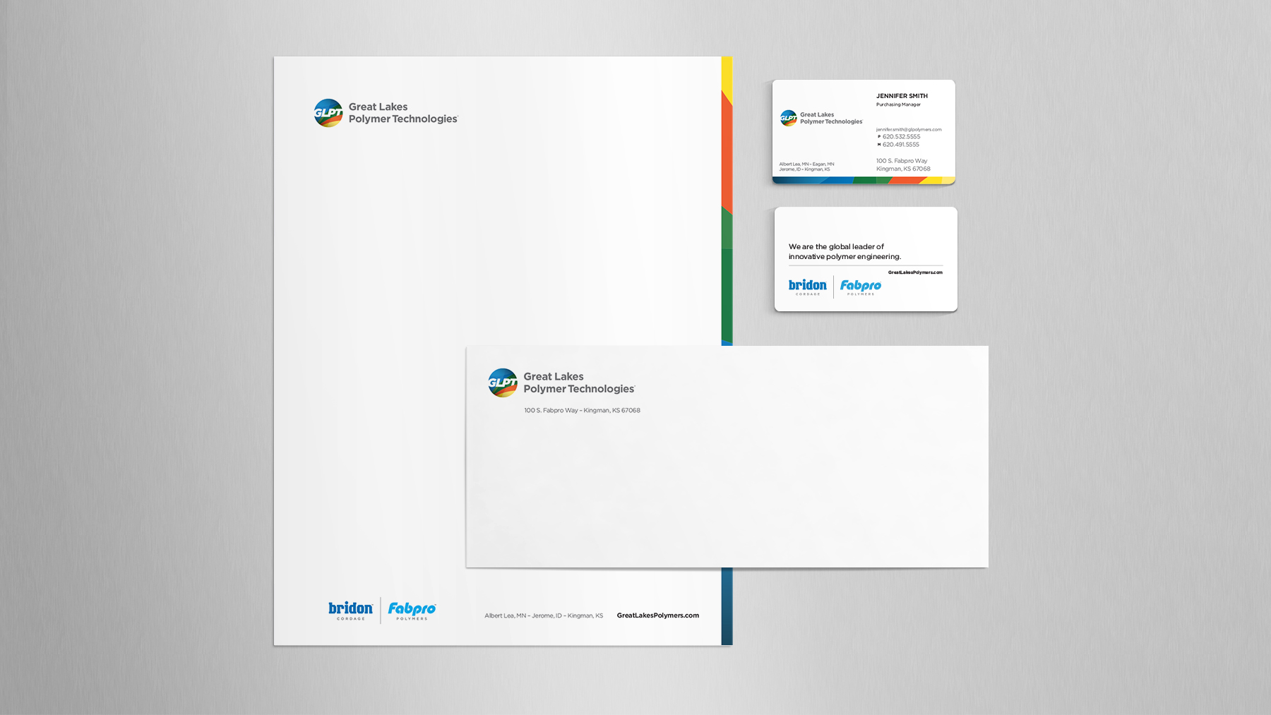
The new family dynamic made its debut on GLPT’s corporate stationery, which prominently features the parent company logo on letterheads and business cards. Bridon and Fabpro appear in secondary positions; a divider separates their identities to signify equal weight.
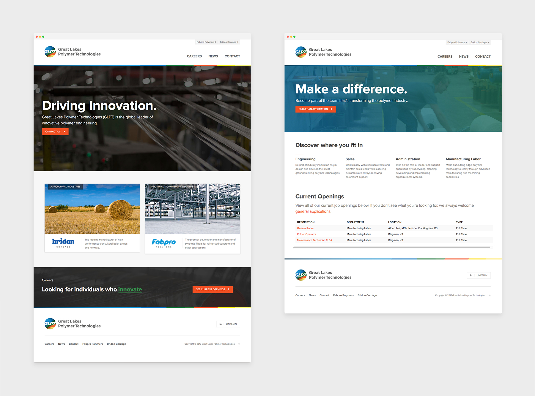
For digital audiences, a website was designed to introduce the revised brand architecture. The site performs certain parental duties, such as promoting the sub-brands and acting as a hub for company-wide news. This is also where users discover links to the subsidiaries’ landing pages. Equally important, the corporate website reinforces the notion of strong family ties.