When Google makes changes, even the smallest of changes, waves are made and people notice. The world notices.
This week was another one of those huge shifts in the appearance of everyone’s favorite Internet giant. So naturally, we’ve asked our designers for their feedback on this shift into a new era of Google.
“Google is all about change and innovation; their logo is ground zero for that. Somehow, their extremely small changes cause the entire industry to comment.”
“Google went the extra mile in creating Product Sans to be used in their logotype, but for me it’s the animation that makes this new logo really sing.”
“I like the new Google logo evolution. It’s an important step toward unifying the universe they have created. Everything they do lately feels like it’s meant to make our interactions more pleasant.”
“I like how the slanted e aligns with the descender of the g. Little touches like that show that it’s more thought out than the simplicity would imply.”
“The new logo is more in line with their icon set and material design standards.”
“The new logo is a worthy improvement on an ever-growing and -evolving company and brand. It’s simple, playful and colorful. They have done an excellent job building a scalable identity that will hold true for years to come.”
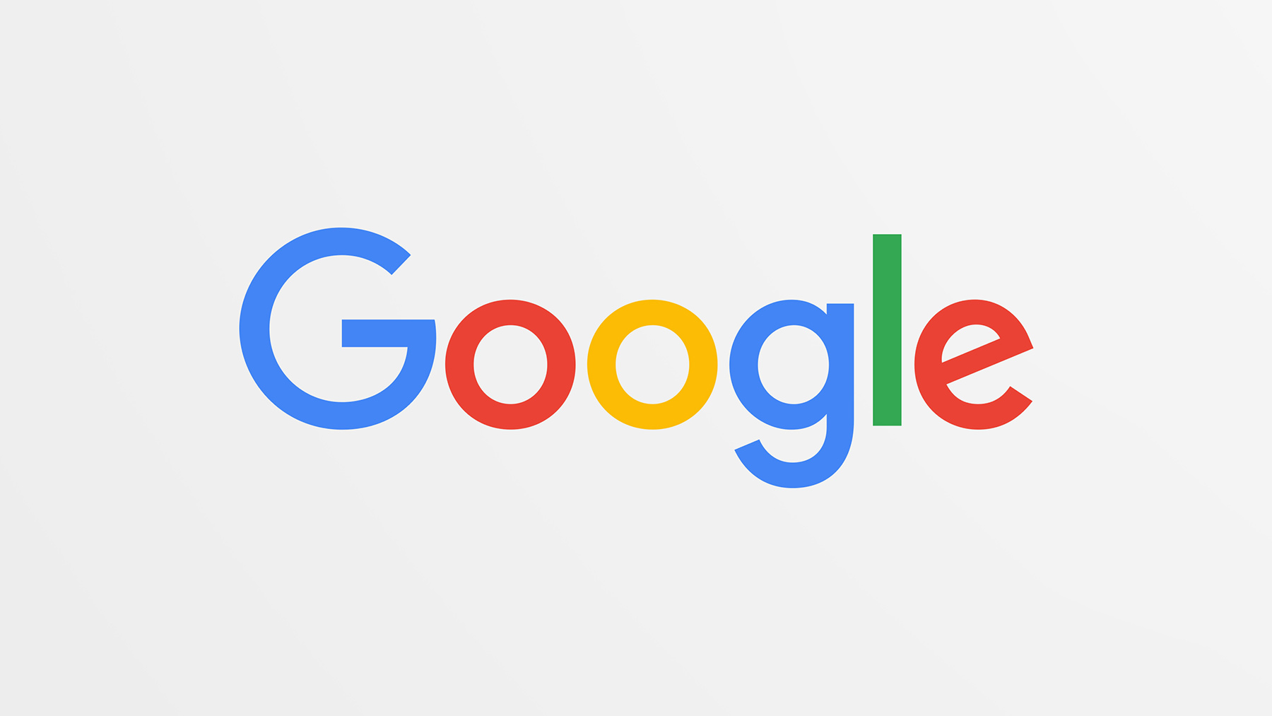
Is the Google Logo Better?
Google’s new direction with their logo unified the brand and experience. Of course, it’s still a logo, but the new design goes beyond its expected role. Each piece comes alive in simple animations that transform the letters to give user feedback.
Before now, Google’s changes to the logo have been minimal. They dropped the shadow, lost the bevel and tweaked the letter shapes by a few pixels. This most recent update is a drastic shift away from the long-lived serif font.
The new identifier is fresh, colorful and simple and our general consensus: better.